Creating Accessible Content
Principles
W3C Web Accessibility Guidelines
The World Wide Web Consortium, the standards organization charged with standardizing the World Wide Web, has a set of guidelines for creating accessible web content. The guidelines consist of four qualities that all web content should aspire to.
Perceivable
Guideline 1.1 - Provide text alternatives for any non-text content so that it can be changed into other forms people need, such as large print, braille, speech, symbols or simpler language.
Guideline 1.2 - Provide alternatives for time-based media.
Guideline 2.1 - Make all functionality available from a keyboard.
Guideline 3.1 - Make text content readable and understandable.
Guideline 4.1 - Maximize compatibility with current and future user agents, including assistive technologies.
W3C Web Accessibility Guidelines
The World Wide Web Consortium, the standards organization charged with standardizing the World Wide Web, has a set of guidelines for creating accessible web content. The guidelines consist of four qualities that all web content should aspire to.
Perceivable
Guideline 1.1 - Provide text alternatives for any non-text content so that it can be changed into other forms people need, such as large print, braille, speech, symbols or simpler language.
Guideline 1.2 - Provide alternatives for time-based media.
- Provide full transcripts of any media containing audio.
- Presentation of information should be practical above all else.
- Contrast colors on screen. Media containing audio must have options to pause and must allow for volume control over that specific piece of media. Audio must contain minimal background noise. Text must be adequately sized (default sizes are encouraged). Pictures of text are always considered decorative and, if necessary for comprehension of the content, must be accompanied by identical text.
Guideline 2.1 - Make all functionality available from a keyboard.
- All content must be accessible via keyboard with no timed keystrokes.
- Provide extra time or a mechanism for students to grant themselves extra time for assignments given to students with disabilities.
- Moving, scrolling, blinking, or automatically updating content must be able to be paused or hidden if the movement is not an essential part of the activity, or be accompanied by a static copy of the information. Try to avoid providing content where exact or near-exact timing is required to understand or complete an assignment.
- Never include a web page or media article that flashes more than three in any one second.
- Make sure web pages are titled, as well as the different sections of the web page. Navigation elements on the page should allow users to navigate the content sequentially. Multiple navigational elements should be present, including an indication of where a user is in relation to other pages. Users should be able to tell the purpose of a link by the link text alone.
Guideline 3.1 - Make text content readable and understandable.
- When creating content, use language and phrasing identifiable by screen reader software. Include explanations for unusual words, slang, jargon, abbreviations, and difficult pronunciations. Include a different version of a text if its reading level exceeds that of lower secondary education (screen reader software is often times not sophisticated enough to read extremely advanced text comprehensibly).
- Major changes in context should be made only when at request of the user or when the user is made aware of the change. Elements of a website that are alike should stay consistent across multiple web pages (navigation, page structure, etc).
- Errors in input and website usage are reported to the user in text and are easily accessible by screen readers and other user agents. Instances where users are required to submit information include labels and instructions. Such instances should also allow users to either review their completed input before submitting or resubmit information that was submitted in error.
Guideline 4.1 - Maximize compatibility with current and future user agents, including assistive technologies.
- Content, especially HTML and web forms, should be fully accessible by screen readers and other user agents. Following the rest of the W3C web accessibility guidelines will go far in making sure this is accomplished.
Color
The National Institute of Health describes colorblindness as “a problem with the pigments in certain nerve cells of the eye that sense color … If just one pigment is missing, you may have trouble telling the difference between red and green. This is the most common type of color blindness. If a different pigment is missing, you may have trouble seeing blue-yellow colors. People with blue-yellow color blindness often have problems seeing reds and greens, too.”
Estimates say that between eight and ten percent of the male population has some form of color blindness. Around 1 in 200 women are colorblind. These figures mean that colorblind students are an inevitability and must be accommodated for in all aspects of online education.
Contrasting the colors in your content is mandatory for those who want to ensure accessibility. Black text on a white background is the default color scheme for most mediums by which we create content, and using default values are usually the easiest way to be sure your content is accessible. However, using color is a great way to bring character to your content, and so long it is accessible to everyone, colorful content is fun content.
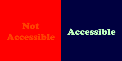
A light-colored background with light-colored text of a similar hue is not accessible. A dark-colored background with light-colored text (and vice versa) of a lighter hue is accessible.
To test a specific color scheme, we recommend using WebAIM’s Color Contrast Checker. The contrast checker will let you know if your color scheme meets W3C’s standards for color contrast.
As a rule of thumb, never use color alone to convey meaning. Instead, use additional formatting (such as bolding) or markings to indicate colored content.
As a rule of thumb, never use color alone to convey meaning. Instead, use additional formatting (such as bolding) or markings to indicate colored content.
Images
Images are present throughout most content provided to students. Students that cannot see images because of a disability must rely on alternative text to understand the content. The role of alternative text is to provide an accessibility for all information provided in image form. Ideal alternative text provides an entirely equivalent experience for readers who can’t view the image. Every non-decorative image must have alternative text that acts as a total replacement for the image. While every image must have an alt attribute in its html, decorative images must have an empty alt attribute (alt=”” in html) so that screen reader software doesn’t read them. A decorative image is any image that is: present solely for decoration, an image present for spacing or other aesthetic purposes, or an image that is adequately replaced by text in its immediate context on the page. Images with text as their primary focus are not recommended, but if necessary can have alt attributes with text that matches the image.
For additional information about writing accessible alternative text visit the following links:
WebAIM: Alternative Text
AccessAbility: Image ALT Tag Tips
Videos
Transcripts
- Guideline 1.1 of the Web Content Accessibility Guidelines necessitates transcripts for any videos included with a course.
- Consult this guide to learn how to add closed captions to your YouTube videos: How-To: Create Closed Captions on YouTube (PDF)
